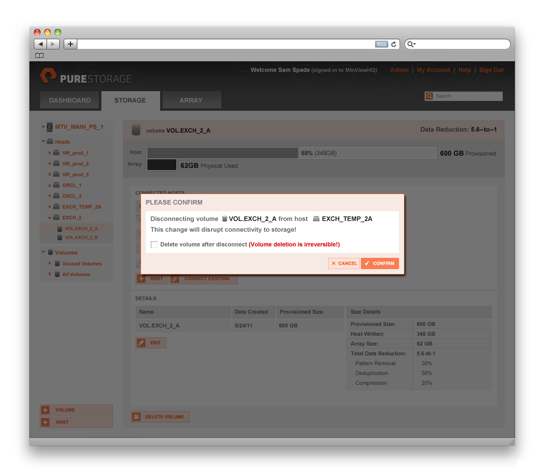
As we started the project, and began to understand the technology and how the hardware would integrate into the enterprise, we focused first on formalizing the PureStorage identity and setting up consistent guidelines. This enabled consistent branding between product and marketing; as well as set up some standards we could rely on for the interface that would help both connect.


Color usage was very key - and needed to be established for use in marketing but also helped us explore ideas around interface colors for both foreground and background elements.
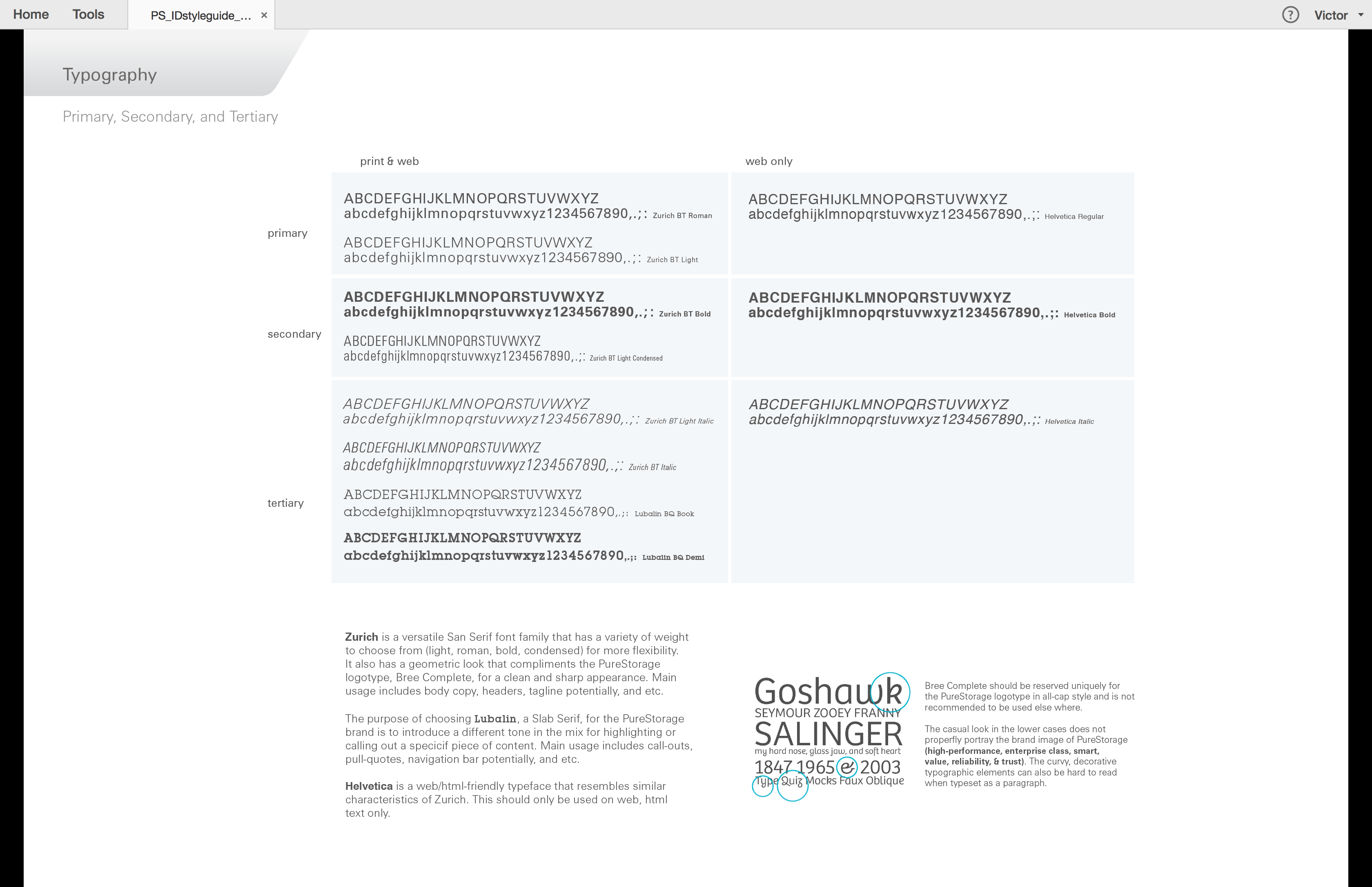
We addressed core typographic options and how a secondary typeface could be used for both screen as well as print.


There was a tremendous amount of "ramp-up" that we had to do first - to better understand exactly how the technology worked that we were attempting to create interface for. From a meta-perspective, the project was to really understand all the different ways to look at information about the storage and what could be controlled - and then organize it.

We explored a lot of different ways to visualize data with this project - and visualizing a LOT of data. Looking at the the complexity (sometimes) for how much information was there and if administrators could handle more or not. Truly, a balancing act. We tried to also use conventions that people were used to - but we also wanted to be efficient and modern - exploring new interface metaphors that could help us make diving into deeper data and specifications easy.

Throughout our design process, we try to address every detail we can find. The more we address up front and discuss with engineering to create a "language" that they can refer to - means less decisions later that we have to make ad-hoc.

In exploring user-models, we literally mocked them up - multiples - so we could evaluate benefits and advantages for each as compared to the other. Of course, through wire framing, we can be fairly efficient at this. Ultimately, we were able to move forward with a direction that we liked and received good feedback from beta-testers on as well.

Like many of our interface projects, getting to the visual design phase is really about extending the company brand - into the interface. We also ensure that there is a strong identity presence as well as supportive graphic language around the interface elements so they are clearly working together vs. two separate elements.

Even interaction details have nuances around color and subtle textures to help emphasize the action that the user has taken.

We look at simple use-cases as well as very complex to ensure the interface holds up in both extremes.

3赞 0评论 396人气

0赞 0评论 286人气

0赞 0评论 343人气

4赞 0评论 381人气
 关注
点赞
收藏
关闭弹幕
留言
关注
点赞
收藏
关闭弹幕
留言
确认要删除该条评论吗?
小小心意,大大鼓励
最高赞赏200元
使用支付宝扫描二维码完成支付
使用微信扫描二维码完成支付
当前余额:¥0.00
支付操作会向你普象账户的注册手机号发送验证码
请注意查收

扫一扫添加
普象商务
扫一扫添加
客服微信

扫一扫下载
手机APP

请关注公众号iamdesign或扫码关注
 沪公网安备 31011502009179号
沪ICP备13011487号-2 上海普象文化传播有限公司
沪公网安备 31011502009179号
沪ICP备13011487号-2 上海普象文化传播有限公司
留言板(0)