
This product was/is built on CKAN which is an open source data portal software that was not being supported...at the time. the strategy was to move away from CKAN for the front-end and rebuild from scratch using Bootstrap, D3.js, and WordPress (for pages relative to marketing content). The over-all idea was to boost user acquisition. We addressed this issue by placing the primary features on the Home Page as a way to incentivize the product by delivering the value proposition prior to creating the account. The only way to do that was to know what the users were after, and deliver it in the most simple experience possible.This was a real project, not a portfolio piece. It is one of my favorites because it allowed me ownership, to test my processes out, and collect real user feedback to base my design decisions on. It was incredibly rewarding to identify opportunities to simplify an incredibly complex product from a six layer deep experience, down to one.

DESIGN SYSTEMThis is a real-world project, the steps I took, rationale, and the outcome.(circa 2016)Competitive AnalysisSide-by-side comparison of product and competitors, recording the mood each products UI evokes, in addition to the Pro's and Con's. This identifies opportunities for design as a solution for creating a gap between competitors.

Current TrendsMarket analysis simply sets the criteria for leading by design within the set market place. To take it a step further, I looked into current trends within a more general category yet relative to the core functionality of the product. In this case, products providing operational and analytical dashboards...data visualization.

LifestyleThree persona's were provided as a jump off point for further research into a generalized perception of the end user's lifestyle. My research consisted of; establishing the pay range, back stories (press releases, blogs, etc) and un-earthed images of each user in their work environment. Note the Lego Star Wars poster on the wall as it will play into design concepts towards the end of this presentation.

Mood BoardsEach mood board was driven by key words intended to set the tone for imagery, UI design examples, fonts, and iconography that I felt would trigger an emotional response that align's with the user's personality..."delight".
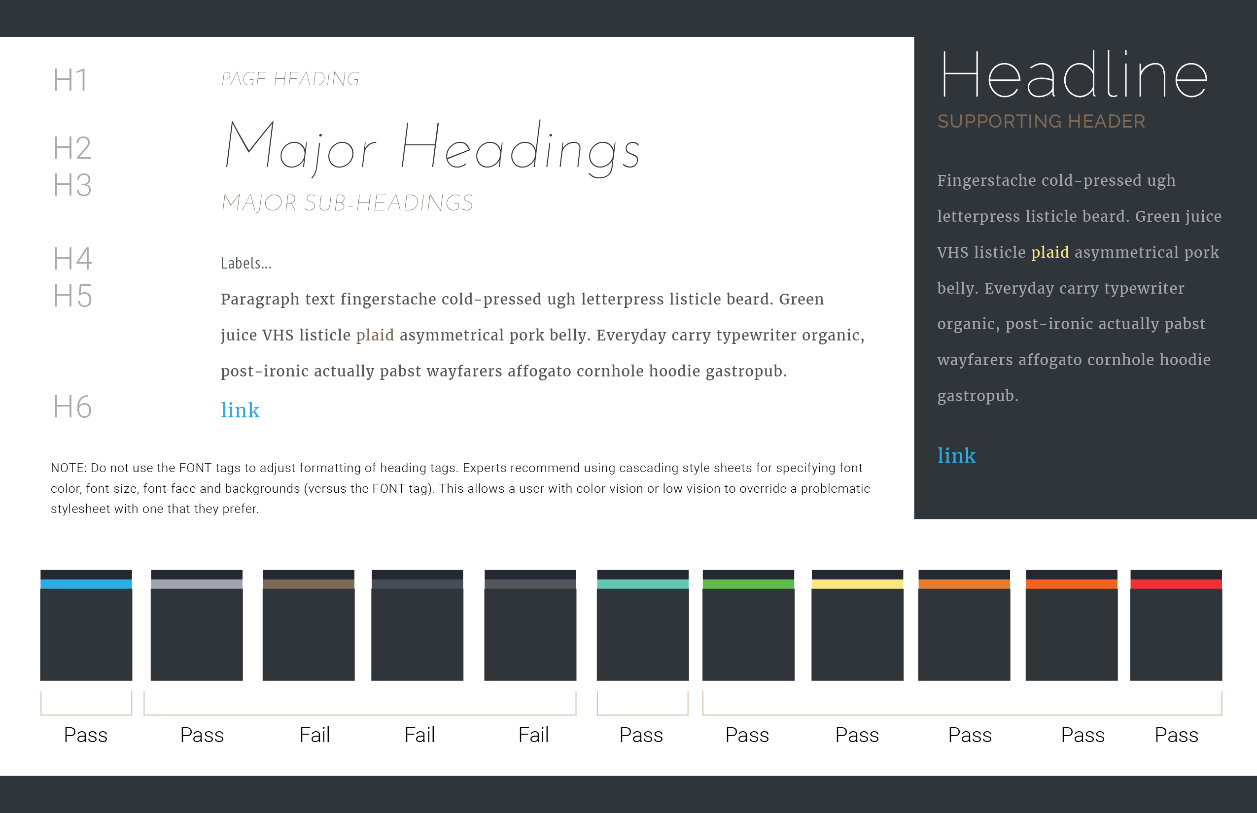
Style GuideWith an established visual aide for basing the UI design aesthetic on, styles evolved from the mood boards, beginning to identify the foundation for a design system.
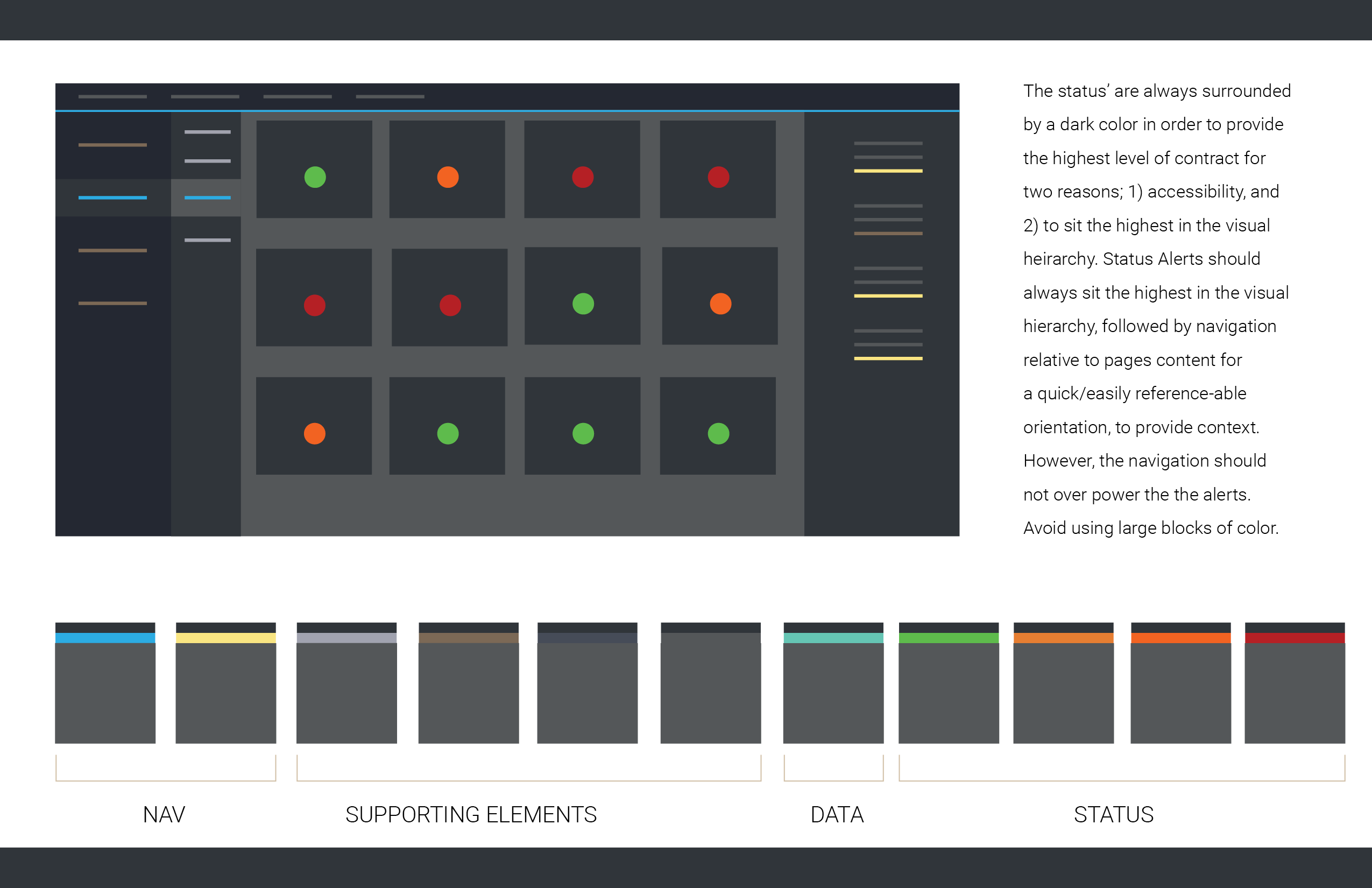
Color PlottingI used a primary page layout from the product I was designing, and plotted color to establish a potential visual hierarchy to test if the color builds, and general look-and-feel, would work.
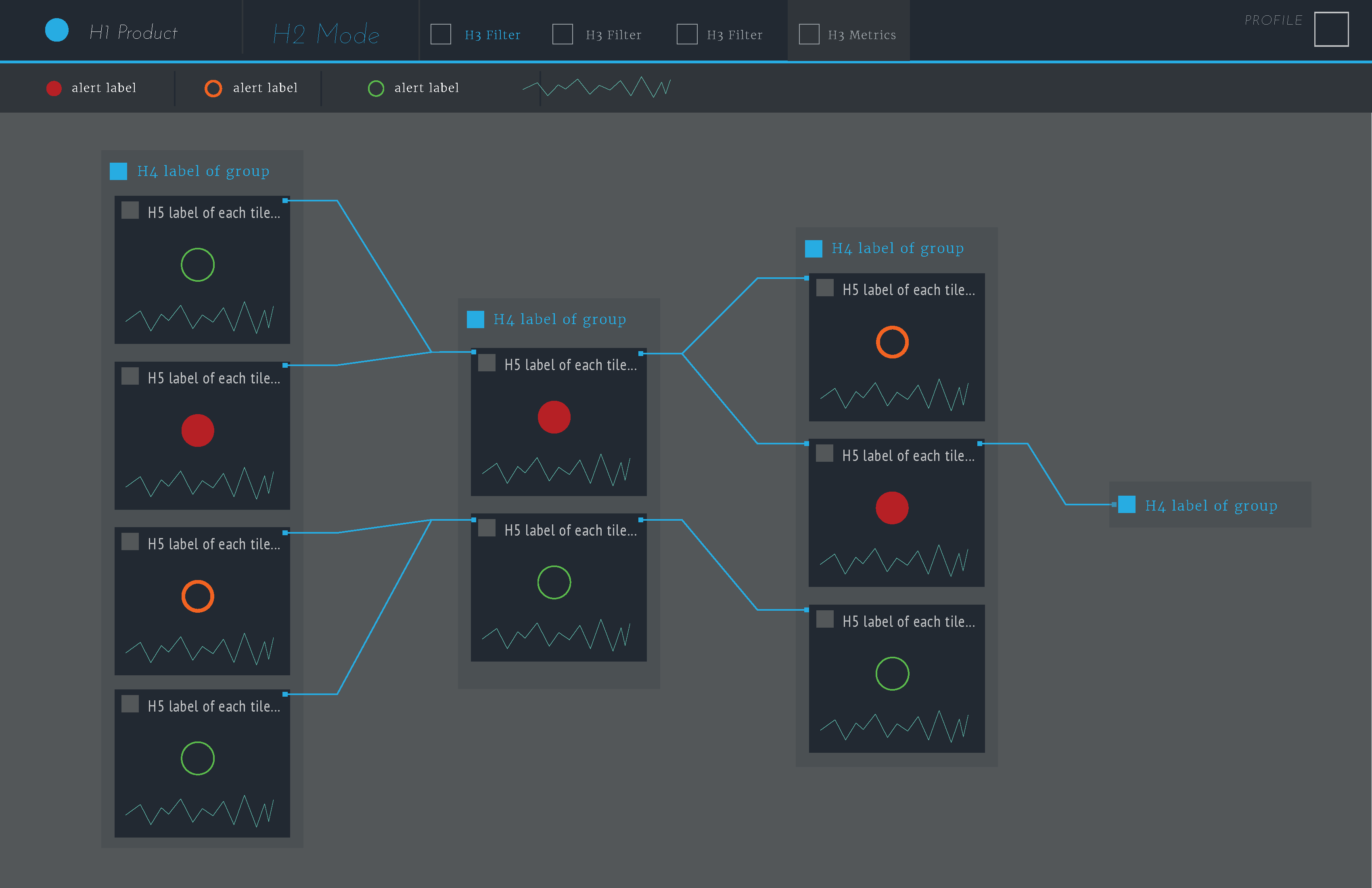
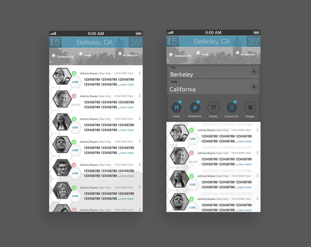
WireframesI use wireframes for a handful of purposes, such as; capturing and structuring content on a given page as the basis of the IA, to demo concepts, and to communicate design intent prior to investing time going in a particular direction. Over time they evolve at a level of fidelity that represents an accurate portrayal of design intent and quickly iterate, based on feedback, without investing too much time. Here I am expanding on the intended use of header tags at a level of fidelity that is more tangible to achieve stakeholder sign off, without spending too much time going with a direction not conducive to the product roadmap. I'm using the following wireframe to sell the idea before moving forward.

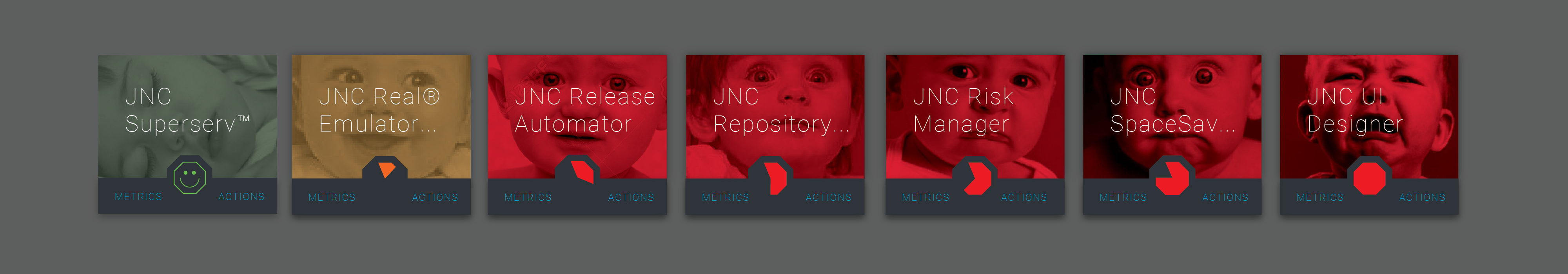
Card Design ConceptsWithin a relationship map view, cards were used as the primary jump off point for a high level read before drilling in to investigate. I was tasked with solving for three things; a visual representation for 7 alert status', and accessibility. I used pie charts to illustrate the intensity of the alert status which solved for both problems in that the real-estate increases with the intensity to draw the users eye to the the more severe as a clearly established visual hierarchy, which also addresses accessibility in that the severity is identifiable via size, in the absence of color. The exploration produced several concepts for addressing these problems, in addition to bucketing actions and relative content (scalability) as well as metaphorical imagery and customization (delight) that ties back to the competitive analysis as way to separate the product from competitors.

Concept 1Weather the StormHeat maps show the increase in energy, or data, across a system. Whether that system is a city’s infrastructure, weather patterns, or an application, it provides the viewer with an instant read on a the intensity of a given data set. In addition to a “storm” being a metaphor for a severe condition, the image supports the pie chart, provides ample visual weight to clearly communicate the level of intensity, as well as addressing accessibility in that the heat map increases in size, and shape.
Concept 2Apocalyptic Triage Cluster maps show the density of data within several area’s of interest. Like maps, applications have several moving parts, or “area’s” where things can go wrong...or right. I call this “apocalyptic triage” because the visual treatment reminds me of a virus spreading which ties in with the frequently used term “triage”. The increase in size of the clusters solves for accessibility in same way a heat map does, but with more defined edges for distinction.

Concept 3Nurturing a MeltdownOur customers monitor these systems constantly. They are their sole focus, and keeping the system(s) they monitor healthy is their number one goal. These systems are like their baby. The imagery is a direct nod to the system as their baby, and brings a personable touch of “delight” to the UI. This also solves for accessibility issues in that the facial expressions provide a recognizable state of distress, whether in color, or gray scale.

Collapsed StatesTo accommodate the zoom levels in the Map View, or to provide the user with options of optimizing their workspace on the Home Page, or wherever else the tile’s would be utilized, the amount of information reduces within each instance. The pie chart becomes the focal point, and primary visual representation of the tiles state, as the tile decreases in size.

The Big RevealDisplaying supporting/relevant information within a dropdown menu, makes the tile scalable for future enhancements. Meaning, additional information (variables, actions, data viz) associated with each tile, in future development, will have a place, consistent in context (Info, Actions, Metrics), for future development and/or implementation within other products. On each tile, there are three clickable areas; the Metric button, the Actions button, and the pie chart (Info). The Metric button would provide a place for any metrics associated with that thing. The Actions button would provide a menu of available actions (Report, Open in Notebook, Investigate, etc) available for that component (application, server, etc.). Info would be all the available information about what the pie chart is based on and/or information regarding the component that the tile represents.

Thank you,
0赞 0评论 374人气

1赞 0评论 364人气

2赞 0评论 404人气
1赞 0评论 248人气
 关注
点赞
收藏
关闭弹幕
留言
关注
点赞
收藏
关闭弹幕
留言
确认要删除该条评论吗?
小小心意,大大鼓励
最高赞赏200元
使用支付宝扫描二维码完成支付
使用微信扫描二维码完成支付
当前余额:¥0.00
支付操作会向你普象账户的注册手机号发送验证码
请注意查收

扫一扫添加
普象商务
扫一扫添加
客服微信

扫一扫下载
手机APP

请关注公众号iamdesign或扫码关注
 沪公网安备 31011502009179号
沪ICP备13011487号-2 上海普象文化传播有限公司
沪公网安备 31011502009179号
沪ICP备13011487号-2 上海普象文化传播有限公司
留言板(0)